Netcitadel Case Study

Changing the approach to security threats and remediation

Overview

Originally, the concept for the flagship Netcitadel product was to solve a single problem: in an enterprise network operations center there are many different kinds of network devices from many different vendors. Naturally each vendor has a solution for configuring their own devices, but you can't for example configure Juniper devices in a tool for Cisco devices. Because of this, operators must specialize or become familiar with many different configuration tools.

Netcitadel's value proposition stemmed from the fact that the One Control tool could manage the configuration of devices from many vendors including Juniper, Cisco, Palo Alto Networks, and so on.

Of course, with that breadth of functionality also comes complexity, since different platforms surfaced features in different ways.

The Pivot

At nearly the same time that the product was ready to ship for beta testing marketing and sales identified an important flaw in the strategy we were executing on. Sales leads uncovered that most enterprises are unwilling to pay for configuration tools since they could save the money by using vedor supplied tools and employing sophisticated expert users who are completely comfortable with the CLI in a terminal window.

The sales team did hear a consistent call for threat response, analysis, and remidation tools though, and so with a very short development window the company pivoted to designing and creating a tool to compliment the configuration offering that was targeted to security.

The Problem

Many modern security ops centers focus primarily on reacting to security threats after they occur, doing root-cause analysis, and then adjusting configuration and processes to prevent repeat occurrences. This means however that operators must first isolate information about the issue, sometimes from multiple sources such as logs or monitoring software and then they correlate it. Once the suspected issue is identified, operators have to create a fix, often by adjusting configuration on one or more network devices. This configuration change is tested and if successful pushed to the affected devices. The issue is usually documented in an issue tracking tool, specifying the operator, date, time, a description of the issue and fix, and the issue is marked as fixed in the issue tracking tool.

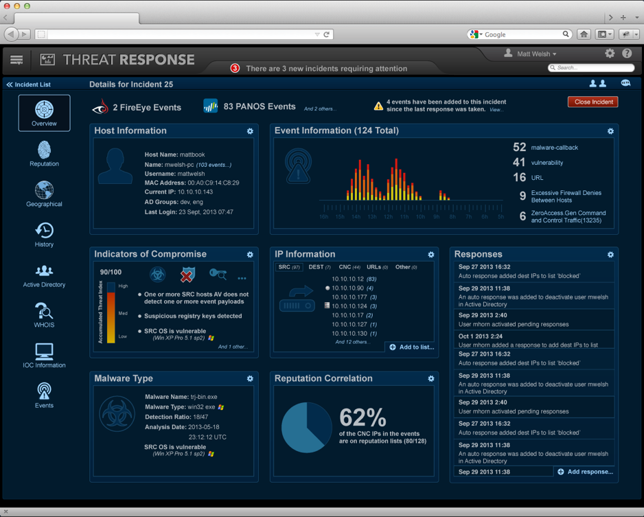
But what if an operator could be notified of an issue and be shown information about it including confederated root-cause analysis from monitoring systems, and a suggested remediation? And what if all of this could be done in one tool, including the hygiene tasks at the end documenting the fix?

Roles & Responsibility

I was hired into Netcitadel as employee number one, and was the sole designer for both One Control and Threat Control (later called Threat Response). Since it was a greenfield project I was able to run a solid end-to-end UCD process. This meant understanding who are users are, quick ideation using white boarding, low fidelity paper sketches (for "design walls"), card sorting exercises to determine the optimal IA, high fidelity clickable mockups, and finally pixel perfect interactive redlines.

It was also my responsibility to test designs with users, summarize results of those tests, and adjust designs to include feedback, while making sure that the implementation reflected the design accurately.
Know Your User

As with any design project, the single most important task is to ensure you understand the user. Users of Threat Response were highly expert security and network operators. This understanding is especially important because one of the core principles of good design is making things easy to understand for users, so the workflows are unambiguous, sensible and create a sense of confidence in users. For many types of applications this means hiding details that are infrequently used, using progressive disclosure to guide users through workflows. Being security operators responding to threats, Netcitadel's users however want to see everything possibly relating to incident on the screen in some way. During design reviews I regularly heard feedback like, "Just put it all on the screen at once, I don't want to have to go between tabs," or, "I'd prefer to scroll sideways than have collapsed accordions. Don't collapse ANYTHING by default!"

What Is The Ask?

Since a single incident could reflect many events across several disparate systems, the problem of how to slice and display correlated information became the most important aspect of the system. To determine a reasonable IA I initially used card sorting both to describe the menu available to the user, and to design the dashboard the user would first encounter. Next, I started drawing on white boards and on paper to conceptualize high level ideas. Since I was the only designer for One Control and we had few other employees, I was forced to do these alone and then float them by users, but later the company had grown large enough that I could have fast design sessions. This involved gathering members of the team that understood our users, and doing "Three design ideas in ten minutes", where all participants (myself included) are given three sheets of paper and some colored pencils and asked to draw three concepts for how to do a task, for example how would the user correlate geolocation with a particular incident. Even with non-designers doing these exercises interesting ideas always appear. It also has the side effect of helping developers and other participants understand the design process, and besides it's just plain fun.

Iterate!

The next step in the design process is to take the ideas from interviewing users and any design jam, along with the IA suggested by the card sort and to create mockups to design the actual workflows. For my these deliverables often take the form of low-fidelity drawings that are scaled roughly accurately (as opposed to hand drawn sketches or some tool like Balsamiq, which in my opinion suffers due to it's attempt to look like hand sketching. My wireframes aren't perfectly aligned (in the interest of time), but do suggest what the application will "feel like" and can be used to create clickable prototypes that allow a user to at least follow the happy path through the application.

"Make it 15% prettier!"

Yes, I actually heard this exact sentence once. In this case, I was told by the CEO and the marketing guy that we not only had to build all of this, but it had to look stunning during demos. They used words like intriguing, interesting, dramatic, and even that unfortunate cliche, sexy. The rationale was that this application was very likely to be on a large monitor all the time in a network operations center and besides being perceived as useful and informative, our leadership wanted it to be a "wow" moment when people first saw it.

Wary of the tool not being seen as serious by users, I then started the most daunting visual design ask in my career; make a network and security have the visual appeal of a consumer application, without alienating security operations folks. Remarkably, the product went through only a single iteration of visual design, and was widely lauded inside the company and by several external partners (like FireEye) and customers. I next set about doing a visual design specification that was used to create the CSS to style the application.

Outcomes

Threat Control was well received by beta testers prior to its official release. An early adoption program allowed us to identify area of the product that didn't work as well as I'd imagined, and afforded us an opportunity to make minor changes to ease them. Thankfully, allowing us to move through the project using a methodical UCD process avoided many of the pitfalls early startups sometimes face. Coupled with an amazing development team and supportive management willing to take risks to be disruptive meant that in the end the product was broadly used and well received. Not long after that initial release Netcitadel was acquired by Proof Point to round out their security offering.

My own takeaways from the project include reinforcement that simply understanding and having empathy for users is the single most important part of the UCD process. We did cut corners when necessary to make deadlines, and I compromised with development to adjust as required when something came up, but overall an excellent process resulted in a tool that users really feel addressed their pain in their jobs. As a designer I really can't ask for more than that.

Screenshots and Drawings

A few images from the process.

© Matt Welsh 2019